Miroslav Posavec
Do you have a plain box interior problem? Let’s find out.
Imagine the inside of your house naked. Nude.
I’m not talking about you standing naked while imagining your home, dear. I’m saying to think about your rooms without anything in them.
Are they still interesting? Or are they plain Jane? Dullsville? Boh-ring?
No one wants that.
Photographer Savarian via Unsplash
The biggest secret to solving your nude room woes
I’m gonna save you a lot of time and tell you the secret right off.
The Big Secret: If you don’t make the interior elements interesting first, it’s not going to have the sexy wow factor you’re hoping for.
Even if you get snappy furniture and decor, it’s not going to look finished without architectural support. No pun intended.
Let’s look at ways to punch up your inside architecture. By the way, the word architecture means “built by a master.” You can be the master of your own house!
Wait a minute. Is this post starting to feel R-rated? I’ve already mentioned nudity, sexy secrets and masters, oh my.
Let’s not go there.
To the point, if your rooms look like a basic box with nothing that delights the eye, then you’ve got a problem.
To get the most out of your interior, you need an extra something-something. Let me lay some ideas on you.
Cornerstone Architects
Beam me up Scotty
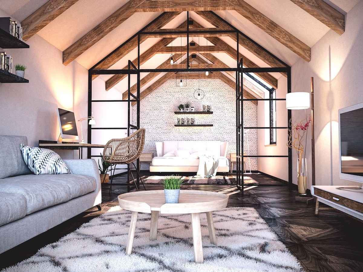
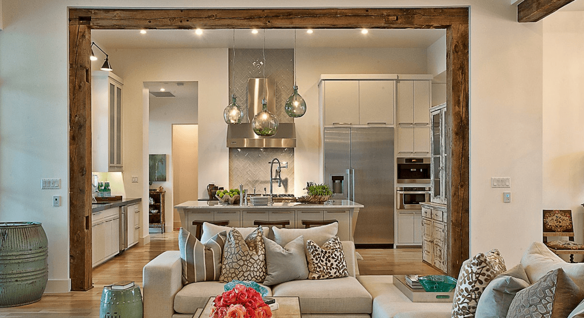
Beams are so handsome! And with the array of faux beams available, you can save some cash and still make your space look very upscale.
The U-shaped ones are nice because you can sneak some electrical wiring through them.
You can also find reclaimed real wood beams from an older property. Or go full out with brand new wood beams.
Cornerstone Architects put together a winning look with beams in the doorway. Use them on your ceilings too.
Thompson Custom Homes
Truss me baby, I love you
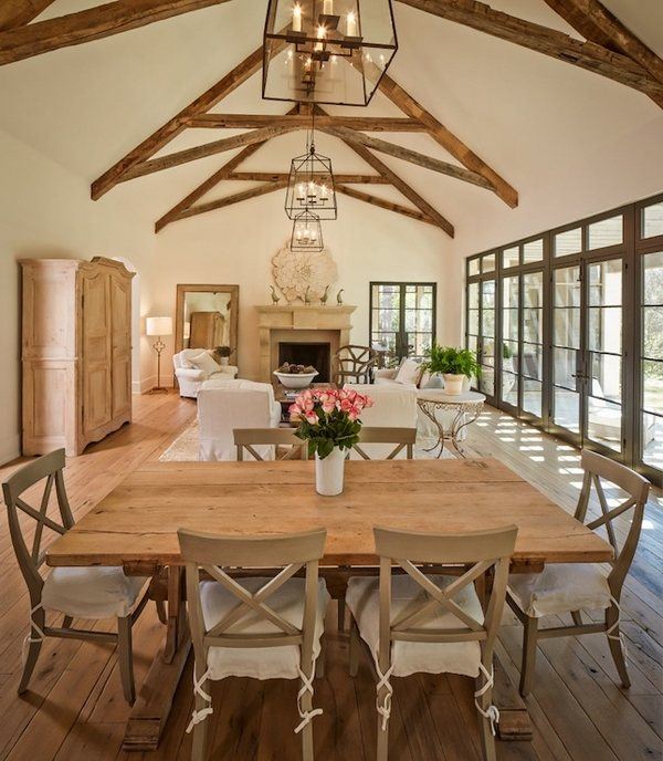
Exposed trusses are beam’s cousins.
They may already be a part of your house hidden by the ceiling. If you’ve got them, you can expose them (woah, x-rated!) by raising the ceiling. Don’t have them? Buy some and tuck them inside a peaked (also known as gabled) ceiling.
I am surprised to find there is a guy on Etsy who sells them!
I can hear it now…”Those trusses are gorgeous! Where did you get them?”
“Etsy.” Hahahaa.
Source Unknown
Move over legs, walls can have skirts too!
Wain skirting that is…known in the biz as wainscotting.
The skirt itself is what most of us call the baseboard that sits at the bottom of the wall, just above your floor. The wainscot is paneling applied above the baseboard that goes one third the way up the wall.
So for an eight foot wall, that would land us at 32”…you can cheat it up to 34” if you prefer.
You can also bring it up two thirds of the wall height, if you like it tall.
The secret here is to never, ever, ever go exactly half way up. You’ll get a spanking from me if you do. It looks terrible.
What do you do with the upper wall? You can paint it or add wallpaper.
Ooh, I just love me some wallpaper! I have to write a post about wallpaper soon. It’s so IN now.
Okay, let’s not get off track.
Add ‘peek-a-boo’ moments
I’m talking about having interesting passage between rooms. Or between spaces within one room! Let me count the ways:
Miller Vang Photographer
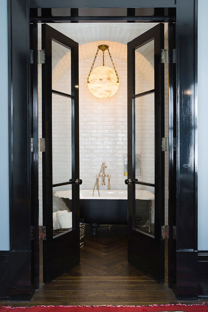
French doors
Oooh la la! Yes, they originated in La France!
French doors are two doors side by side that open together.
They look especially nice when they’re tall, don’t they?
Barn doors
Whoooo let the cows out?
Barn doors are usually B.A.D. (Big Ass Doors).
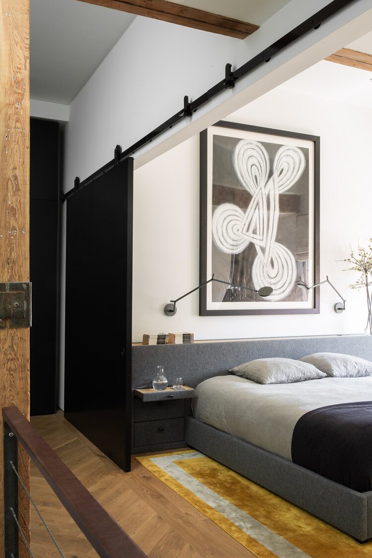
Pssst. Guess what? They can be real space savers because they roll on a slide, side-to-side.
This stunning space by Ashe Leandro from New York has an opening with two barn doors. Here you can see one on the side of a very big opening.
Nicely played.
Source Unknown
Flanked columns
I’m generally not a fan of columns, but when tastefully done, I embrace them. Hugs!
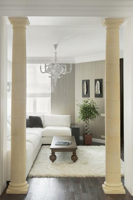
They are best in an upscale, classic room with tall ceilings. I prefer Tuscan style columns. They have smooth sides and very simple capitals (the tops). I love them when they are gracefully tapered.
They look best, in my opinion, flanking an opening, like you see in the picture above.
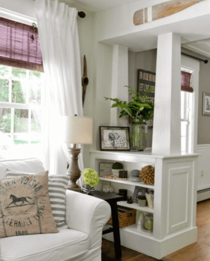
Pony walls
I also don’t like most pony walls, but when paired with columns, it elevates them both.
A pony wall is a short wall. This one in the photo has been turned into a bookcase, which is very inviting.
I grew up with pony wall bookcases in the entrance to our very old barn-shaped home.
I spent many hours there pouring over the Encyclopedia Brittanica that my parents shelled out a pretty penny for. (Thanks mom and dad!)
This look is most often found in Arts and Crafts style bungalows.
Arches
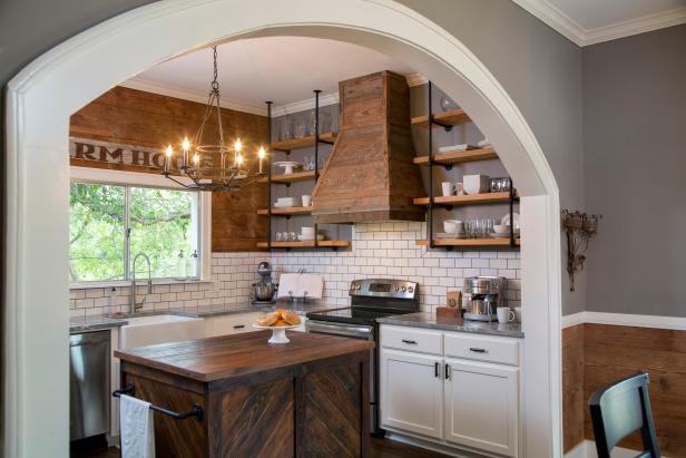
Arches are a friendly way to add softer character to your rooms.
There are plenty of different arch styles to choose from, but that goes beyond the scope of this post. Sorry.
Miroslav Posavec
Window walls
Gosh I love window walls. They make me flush with fever when I see them.
They add an industrial element, like you’re living in a big warehouse with divided spaces.
You can make the whole wall full of windows, or pair them with a pony wall.
Get upwardly mobile
At least with your eyes. Let’s talk ceilings!
Medallions
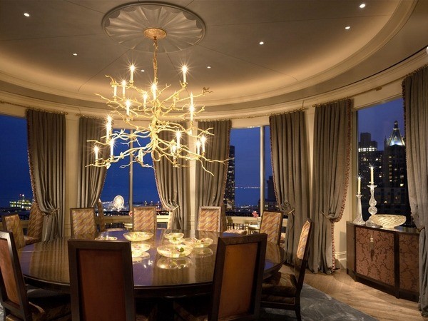
Add a medallion piece to flatter your hanging light.
My hanging lights looooove flattery. They’ve got such big egos.

Medallions work great in dining rooms.
Medallions swing from classic looks to contemporary looks.
Here is one I like that you can easily buy. It’s got a Mid-Century Modern look that I find very appealing.
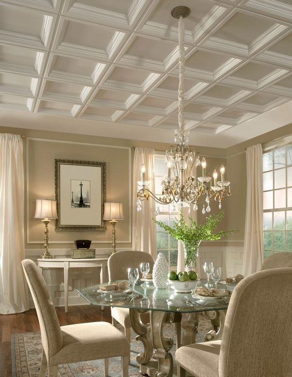
Coffered Ceilings
The word coffered means indentation.
Essentially, it’s a ceiling with a three dimensional grid.
It really makes the ceiling the star of the show!
Are you starting to see how much one architectural element can dress up a drab room?
.
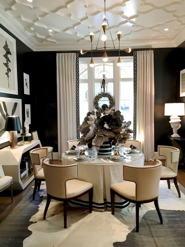
Here is a playful, and contemporary version of a coffered ceiling by Serendipite Designs.
I love how they’ve masterfully played up the drama in this room! I mean just look at it!
I’m a fan of black walls for certain rooms. One of my clients agreed to paint the walls and ceilings of her half bathroom black, and she loves it!
But we’re off track again. So many fun things to talk about!
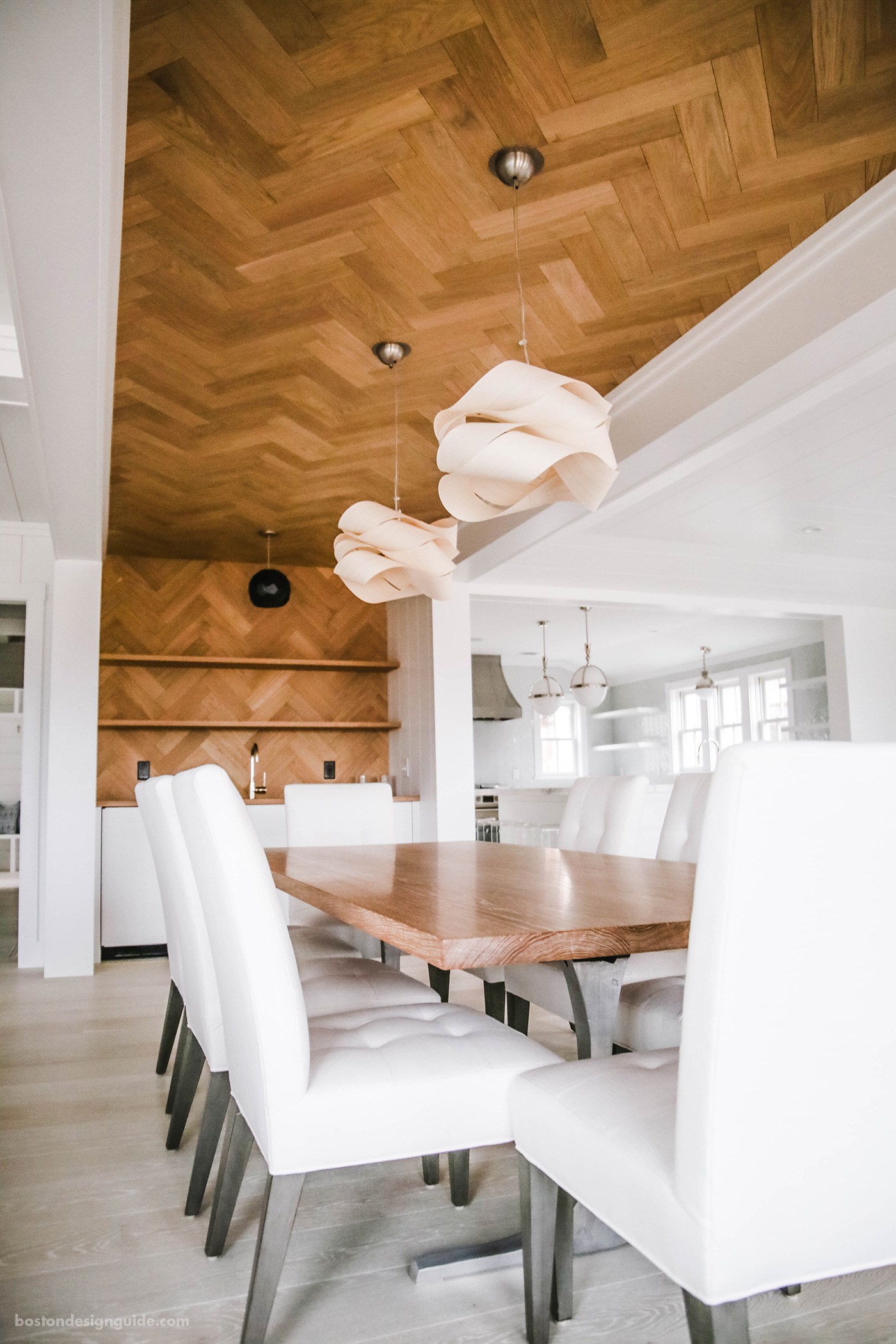
Floor on ceiling (or walls)
Here’s a secret you also may not know.
Some designers put flooring on ceilings!
They also sometimes run it up a wall.
Fun idea, right?
It’s interesting that they chose a completely different color from the floor itself in this example.
Step up your game
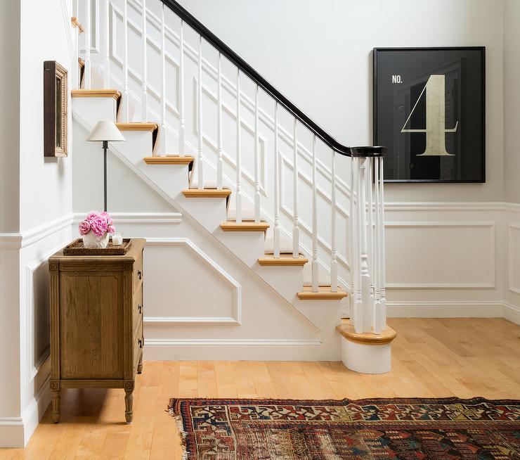
Remember to elevate the piece of the house that elevates you to the second floor! A staircase is a great opportunity to bring your A-game to the hardscape of a room.
Add a *skirtboard on the wall side of the staircase. Add an exciting *balustrade (the fence-like part that keeps you from falling over the side). Play up your *newel posts (the heavy post at the end of your handrail). And voila! A pretty place for the eyes to go.
*Side Note: I never remember these little terms, by the way. I call them the “parts here on the wall,” the “up and down dudes,” and the “thingies at the bottom of the stairs.”
What can I say? I have more important things to remember. Like where I keep my toothbrush.
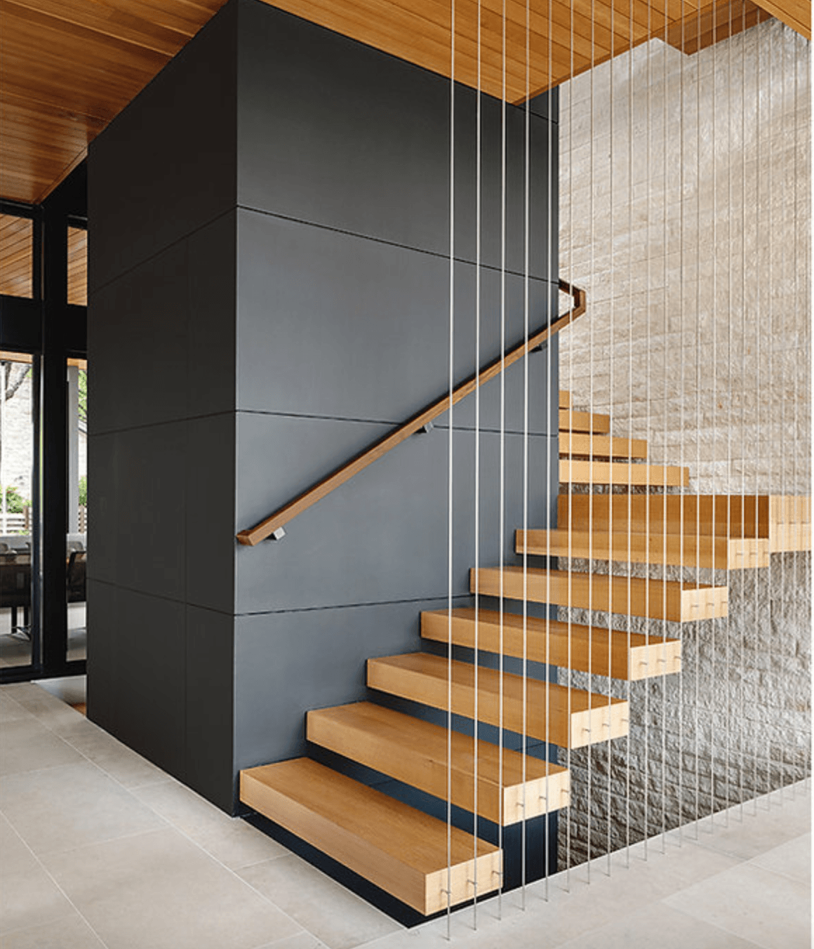
Here’s a fantastic design of a modern staircase.
Imagine having nothing but that in the room? It would still feel like a special place!
That’s the point of this whole post.
This eye-catching staircase was expertly designed by Cornerstone Architect in Austin, Texas.
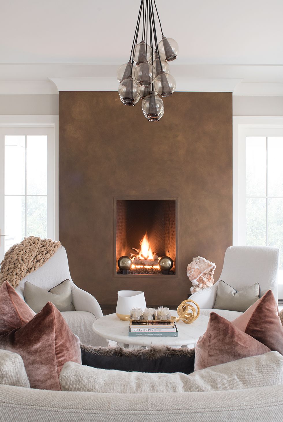
Kris Cochran, Jane Belies Photographer
Your hotspot deserves star treatment
Don’t forget your fireplace!
You can really change the character of a room with a little hot-spot luv.
It can be a grand statement, like this copper colored monolith.
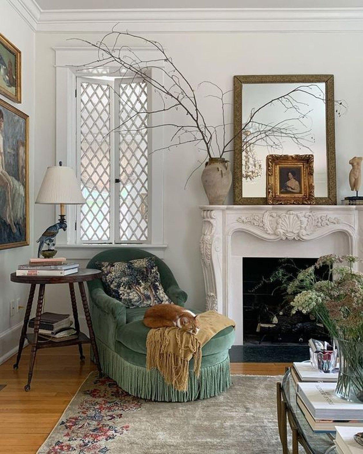
Or a french country gem.
Funny thing is this one isn’t even a working fireplace. But that doesn’t matter. It’s pretty and engaging.
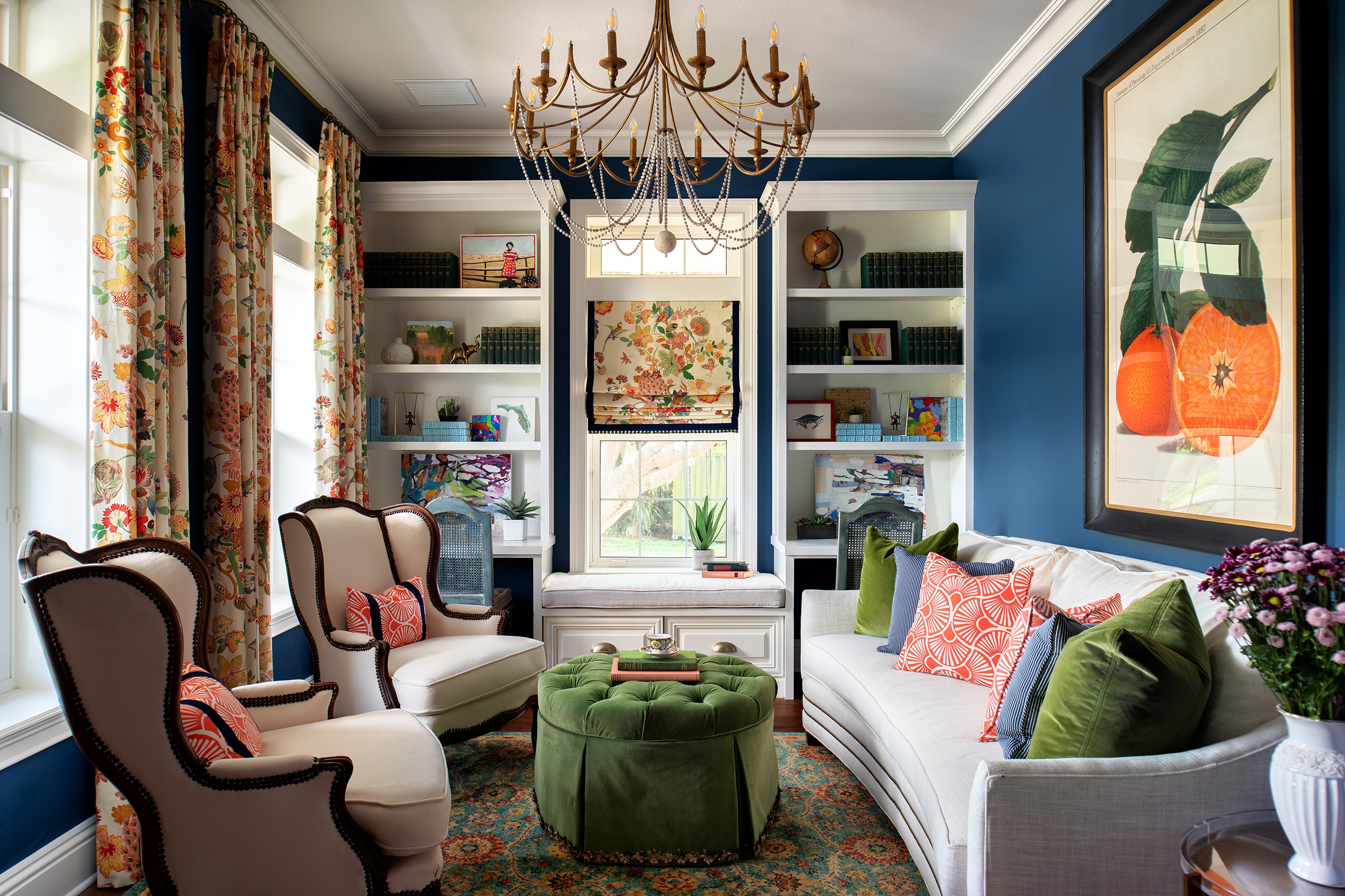
Give your walls a purpose (besides holding up the ceiling)
Create built-in bookcases, cubbies, cupboards, and seating whenever possible.
Can I just point out that Lisa Gilmore has b*lls. I love these bold colors. She must have great skill in selling her vision to her clients.
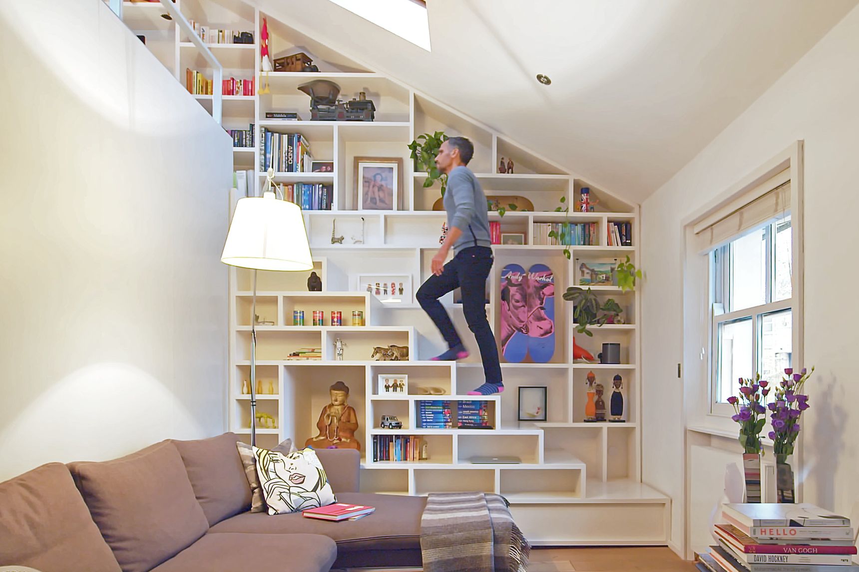
Here is a built-in that doubles as a staircase! They caught two birds with one net! Find this on the Youtube channel called Never Too Small.
It goes without saying, of course, to pay special attention to your rooms with lots of built-ins like bathrooms and kitchens.
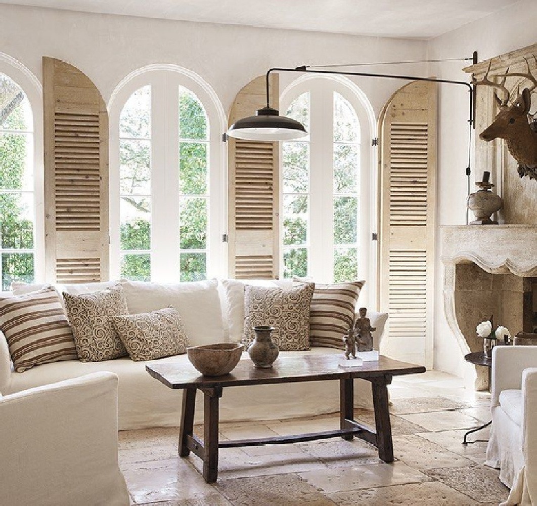
Pamela Pierce Interior, Milieu Magazine, Miguel Flores Vianna Photographer
Pane-fully chic
Add some interesting windows.
There are wonderful vintage finds at flea markets and home recycling centers. If you don’t enjoy rummaging, go ahead and get new ones. Make sure to order them double paned for insulation.
These windows are extra fun because of the added shutter panels.
Pamela Pierce Interior Design, owner of Milieu Magazine is the designer.
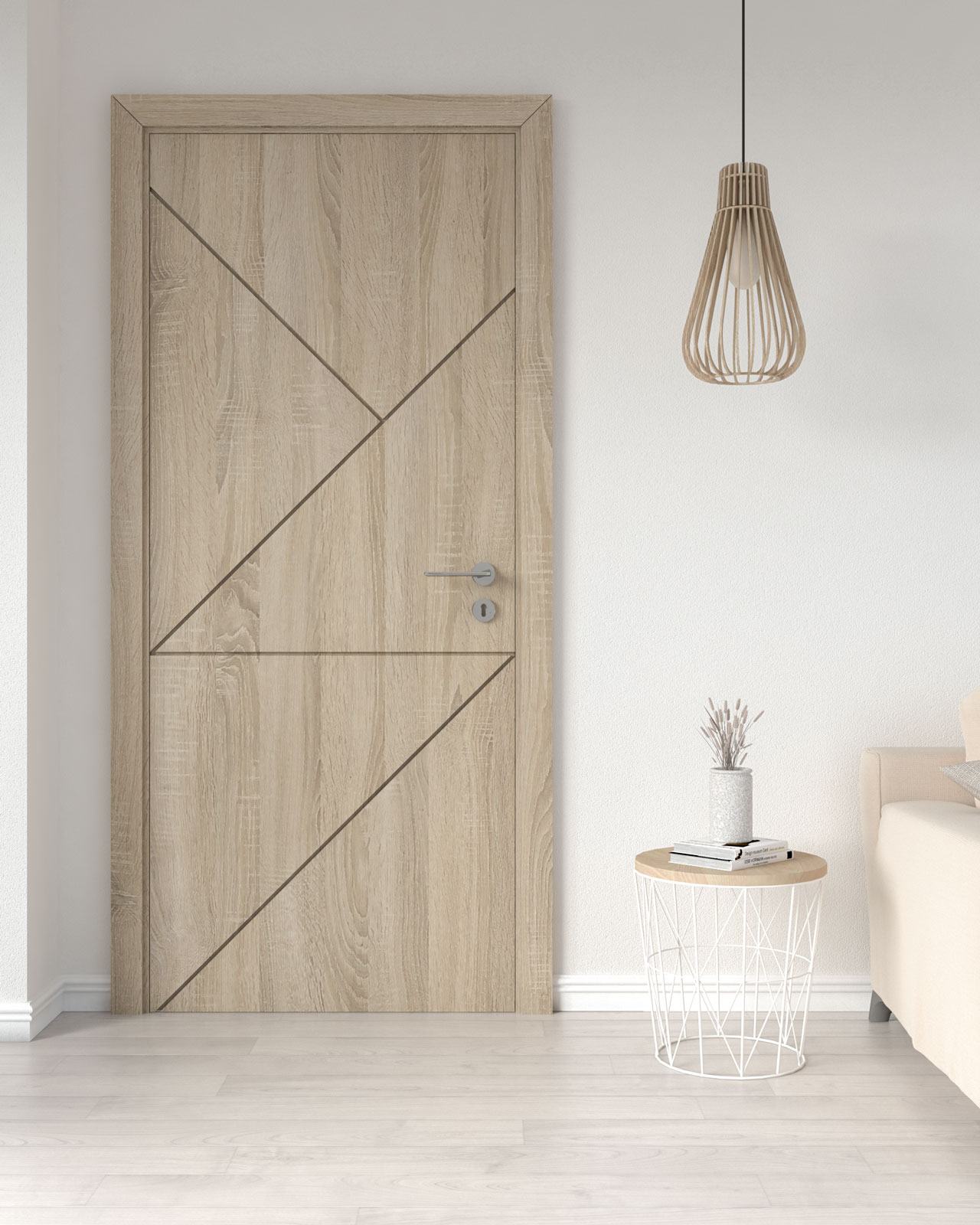
Unknown Source
Don’t pass up passages!
Meaning doors.
Just think of how much visual space a door takes up.
You don’t have to make doors special, but if there isn’t an easy way elsewhere to make a design statement, doors are a good option.
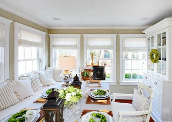
Unknown Source
Get the royal treatment
Get crazy and crown everything off with moulding.
Use crown moulding at the top of the wall. Add it any place you want some extra detailing. Put it on the top of windows, cabinets, and doorways. Just slather that crown moulding everywhere. If it fits, of course.
Add base moulding too, along with door casings, window casings. Paying special attention to moulding can give you a grander space.
Another designer secret is to adjust the door and window heights (if you can afford to). It makes a difference when they are all at the same height.
I can’t tell you how many homes I’ve been in that had half-finished moulding or orphan windows. You know, the ones that are a little different than the rest, or lower than the other windows in the house. Ewwe.
Making them all the same can make a bigger impact.
But Michelle, this all sounds like too much. I need an easy fix to make my place feel more interesting.
Well, firstly, realize you don’t have to do it ALL. In fact, you shouldn’t do it all. But implementing one or several can really wow your mother-in-law.
But to answer your question, here is a relatively easy solution that makes a big impact. Read my last tip.
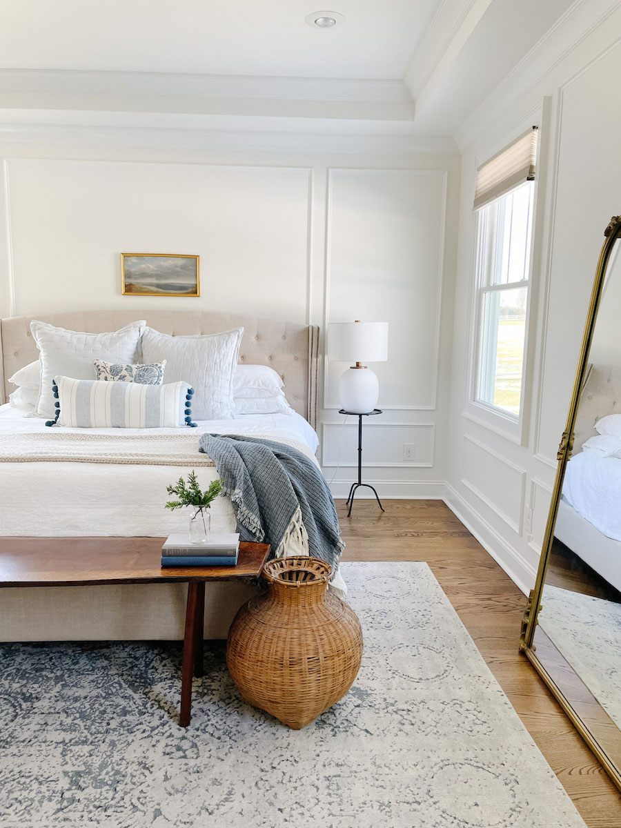
Frame it up: solving the mystery of boring walls
If you’re in a super modern space, then moulding isn’t always a fit.
But most homes are crazy happy with a little “outline” of moulding on the walls. Especially in rooms with big empty wall expanses.
Moulding itself is not expensive, so a DIY’er could manage it pretty easily even on a slim dime.
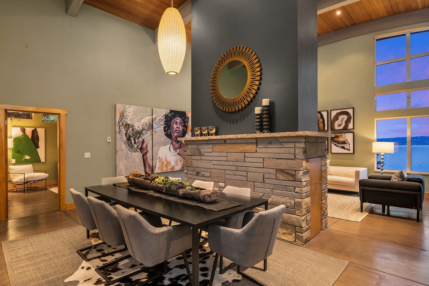
Wrapping it up in an interesting package
Sometimes the gift wrapping can be as exciting as the gift, if you get my metaphor. So, as I’ve been illustrating here, don’t skip fixing up the parts that are part of the house itself!
Hiring a professional will help you identify which elements give you the most bang for your buck. RD Interiors certainly have it together in this home in Seattle.
So remember:
Simple furnishings in a well-designed room will make a bigger impact than fancy furnishings in a poorly-designed room.
There you have it.
There are tons of ways to make your room a little sexier before you put a single thing into it.
There I go again. Sex on the brain. Heh. Heh.. What can I say….I have a hard-on for interior design.
Live Happy, Design Buddy!


Michelle Winter
Hey There! I’ve been designing interiors for 20+ years, and I’m only 30. Go figure (wink) Enjoy reading for inspiration and information on interiors and life styling.

